NASA's scary chart on earth warming since 1880

Home & garden, off grid, saving energy & climate change, going organic & recycling, fire prevention, etc. from condos to backyards. Ferrellgas
Post Reply
User avatar
cabinish
Posts: 11759
Joined: Tue Oct 19, 2010 8:50 am

NASA's scary chart on earth warming since 1880

Post by cabinish »

The good folks at Climate Central made a chart showing the average monthly temperature since 1880, relative to a baseline of average global temps between 1881 and 1910.
. . .Long story short, every single month has been warmer than the early industrial baseline for more than half a century.

Image
Image
Image


http://imgur.com/a/ln60v#LSelNiy
User avatar
cabinish
Posts: 11759
Joined: Tue Oct 19, 2010 8:50 am

Re: NASA's scary chart on earth warming since 1880

Post by cabinish »

The world as a whole has warmed about 0.9 degrees Celsius (1.7 degrees Fahrenheit) since 1880. Arctic temperatures have risen twice that amount during the same time period.

Image
Source: NASA NSIDC - Sea Ice Age V3

https://www.bloomberg.com/graphics/2017-arctic

Image
User avatar
ChromaKey
Posts: 5785
Joined: Mon Jul 14, 2014 7:05 pm

Re: NASA's scary chart on earth warming since 1880

Post by ChromaKey »

I still think that Denver's going to be more popular once all the major coastal cities begin to slip beneath high tide. Hopefully the oil companies have been saving up to buy all that real estate at full value and pay for harm and hardship caused directly to all their future environmental refugees. But I suspect it'll go exactly like the Gold King Mine, because we are a psychotic economy when it comes to connecting cost of consequence to the industrial acts that trigger the effects.
User avatar
Josey
Posts: 10000
Joined: Tue Jan 27, 2015 7:28 pm

Re: NASA's scary chart on earth warming since 1880

Post by Josey »

Why does the temp chart trend start to rise from 1900-1940? Volcanoes, fires?
An intelligent man believes only half of what he hears, a wise man knows which half. -EVAN ESAR
User avatar
ChromaKey
Posts: 5785
Joined: Mon Jul 14, 2014 7:05 pm

Re: NASA's scary chart on earth warming since 1880

Post by ChromaKey »

Search me. Here's what's been suggested by those credible:
The approximate stand-still of global temperature during 1940-1975 is generally attributed to an approximate balance of aerosol cooling and greenhouse gas warming during a period of rapid growth of fossil fuel use with little control on particulate air pollution, but satisfactory quantitative interpretation has been impossible because of the absence of adequate aerosol measurements...
(http://www.columbia.edu/~jeh1/mailings/ ... re2012.pdf)

In other words, nobody was looking for or measuring sufficient global levels of that atmospheric aerosol data, and so now we don't have a way of determining what those aerosol levels were nor precisely their source.

Image

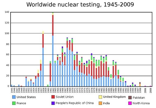
Myself, I've often wondered if all that surface nuclear weapons testing had an impact on atmospheric aerosol level, like so many man-made volcanic explosions...
The conditions during the northern hemisphere summer of 1816 were the result of the largest observed eruption in recorded human history, one during which global temperatures decreased by an average of 0.53 °C, and related human deaths were reported to be about 90,000. The importance of volcanic eruptions during this anomaly, specifically the eruption of Mount Tambora, cannot be overlooked. It is the most significant factor in this important climate anomaly across the globe.
(full article) https://en.wikipedia.org/wiki/1815_erup ... mperatures
Post Reply

Return to “Home, Garden & Going Green”